TypeMedia alumna Noheul Lee wins Gold Prize in Morisawa's Type Design Competition 2019
2 July 2019
KABK alumna Noheul Lee (TypeMedia 2018) won the Gold Prize in the Latin Category of this year's Morisawa Type Design Competition with her typeface Areon. Congratulations!
The award ceremony will be held at Kanda Myojin Hall (Tokyo) on September 3, 2019.
Graduation project by Noheul Lee (TypeMedia 2018)
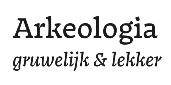
Areon: A Hangul and Latin type family with translation contrast
Areon is a typeface supporting two scripts: Latin and Hangul, it can be used as a text typeface for editorial design. This project began by exploring the relationship between Latin and Hangul, and the subtle side of inverted and low contrast. It is a warm and lively typeface, with an informal touch, inspired by flat brush calligraphy. It is intended for text typeface with a strong personality that shows a quirky and humanist look. It consists of a family of three styles (Roman, italic, and Hangul) with six weights for each: from light to bold. Areon can be used for body text and headline in a wide range of situations. Its name comes from Greek mythology: a poet and musician, his name means “Enchanted” and “Melodious”.