update 21 October 2021
Dutch Design Award in the category Communication for Stay Sane, Stay Safe campaign
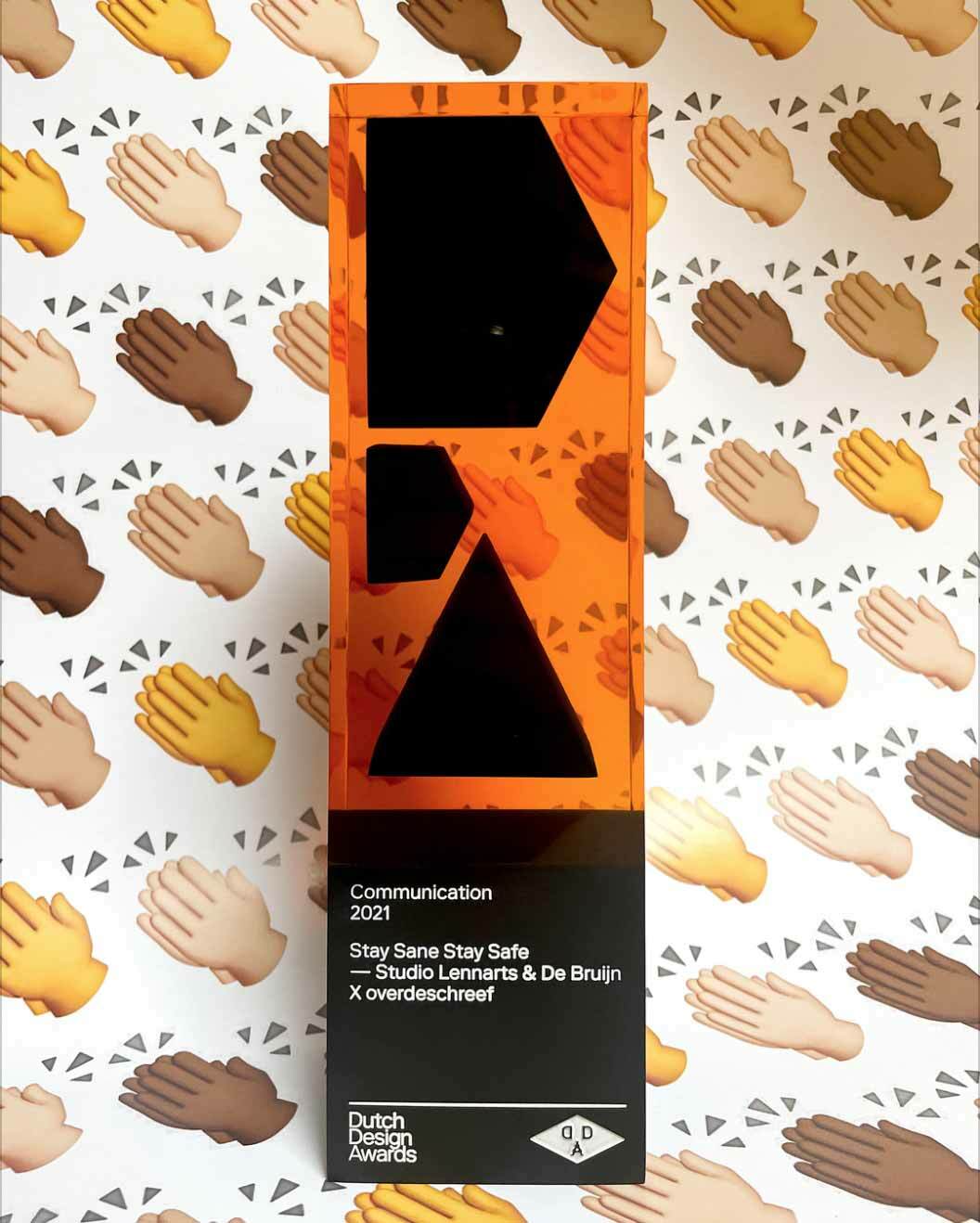
‘Stay Sane, Stay Safe van Studio Lennarts & De Bruijn x overdeschreef shows how valuable the reactive role of designers can be to the zeitgeist and has great symbolic value in a historic period.’
The following interview is part of a
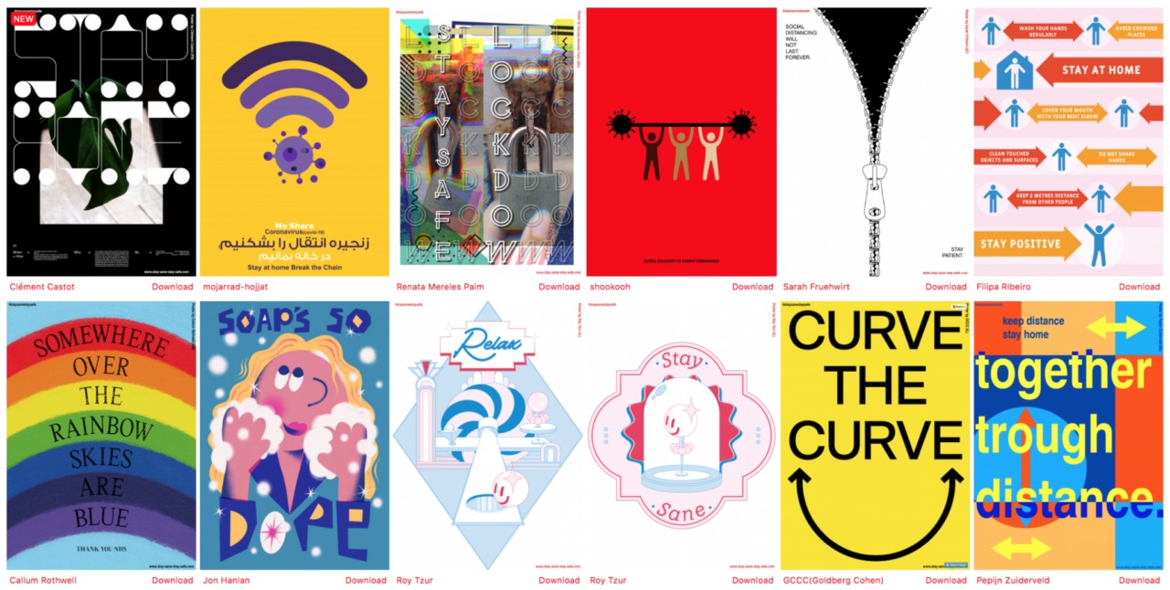
First up, an interview with KABK Graphic Design alumni Max Lennarts and Menno de Bruijn of the design studio Lennarts & de Bruijn about their project initiative ‘Stay Safe, Stay Sane’. This project could not pass by unnoticed, as their call for posters in support of healthcare workers resulted in more than a thousand entries from all over the world!
And is still counting...
Hi Max, thank you for your time. We noticed your poster campaign and wanted to know more about it. But first of all. How are you doing these days? What impact does the virus have on you?
The whole coronavirus has quite an impact on us. As you may know, we mainly work in the cultural sector which now is completely disrupted. No museums, no exhibitions, no festivals, no parties. So in order to get through this situation we are using our savings. It's also starting to be a bit stressfull on a personal and psychological level, this 1,5m society. What's life going to be like? Nobody knows.
Yet you don’t stand still! How did you come up with the idea of the poster campaign?
On Sunday the 22nd of March a friend of ours who works at the OLVG Hospital in Amsterdam sent us a text message asking if we had a nice poster to cheer up his colleagues in the hospital. At that time we didn't have any posters but we of course could make them. While showering, the idea sprang to mind to make it bigger. I immediately called Menno. An hour later we went to work.
We also approached a friend of ours, Ronald; aka ‘Over de Schreef’, to work with us. At the end of the day the project was all set and we even had a website ready.
The action has an activist and social character, is that important in your work?
In our own work, activism and a social component are very important, but during the design process, this often happens somewhat unconsciously or automatically. But we also like to hit a nerve and use it in our communication. As image-makers we feel semi-responsible to tell a social story, we don’t see this as crucial to what we do, but as designers, we can ensure that something that is unclear and abstract, is made clear to everyone. That's certainly true if you're a visual communication professional, as far as we're concerned, we prefer to do that with a bit of humor.
The scope of the action is enormous and still growing, did you expect the action to be such a success?
We never really expected Stay Sane Stay Safe to be such a success so soon. We’re now talking about 1200 posters from 76 countries and they keep on coming. Of course, we had hoped and aimed for this. During the design process, it was always in the back of our minds. We believe that when you do something you have to do it right and always think big. This action is socially relevant and cross-border if you combine that with a wide reach in the design world you’ll soon have a chance that it will be picked up on a large scale. It’s great to see that the project provokes reactions, it feels pretty good when it all comes together like that. What we’ve also noticed during this process is that when you do something pro bono and you’re transparent about it there are always people who are willing and able to help you.
What do you think would make this action ultimately successful?
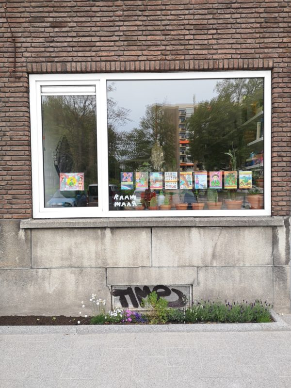
For us, this project would be extremely successful if we receive photos from all over the world, preferably from people who hang the posters in their own windows. It would also be great if people abroad could set it up themselves, for example, that someone would make a deal with a printer in Spain and then send a number of posters to the regional hospitals.
What we have reached in Breda is also very sick. There, the posters and the project not only reached creative people but also people outside the hospital: the general public, the healthcare provider, the regular Joes! It would be very sick if that would happen more.
Of all the posters that have been submitted, which one appeals to you the most? Why?
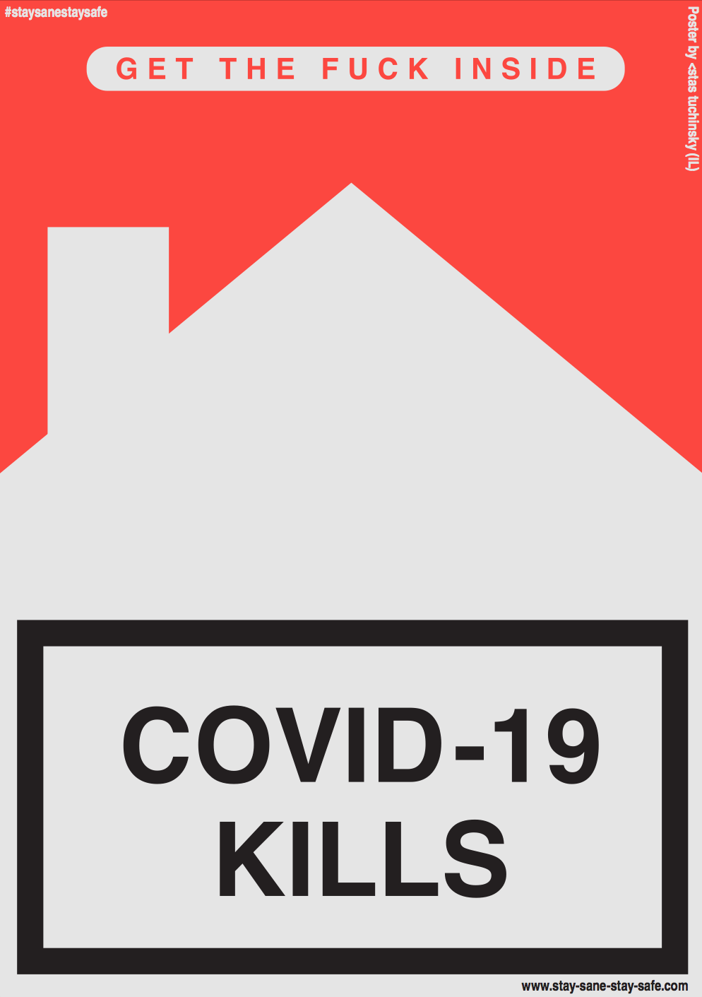
Personally I see the poster with 'Covid kills' as a favorite because of the shape and color and Marlboro's warning label. It immediately hits when you see it! I also find the subtle reference to the house very smart and strong.
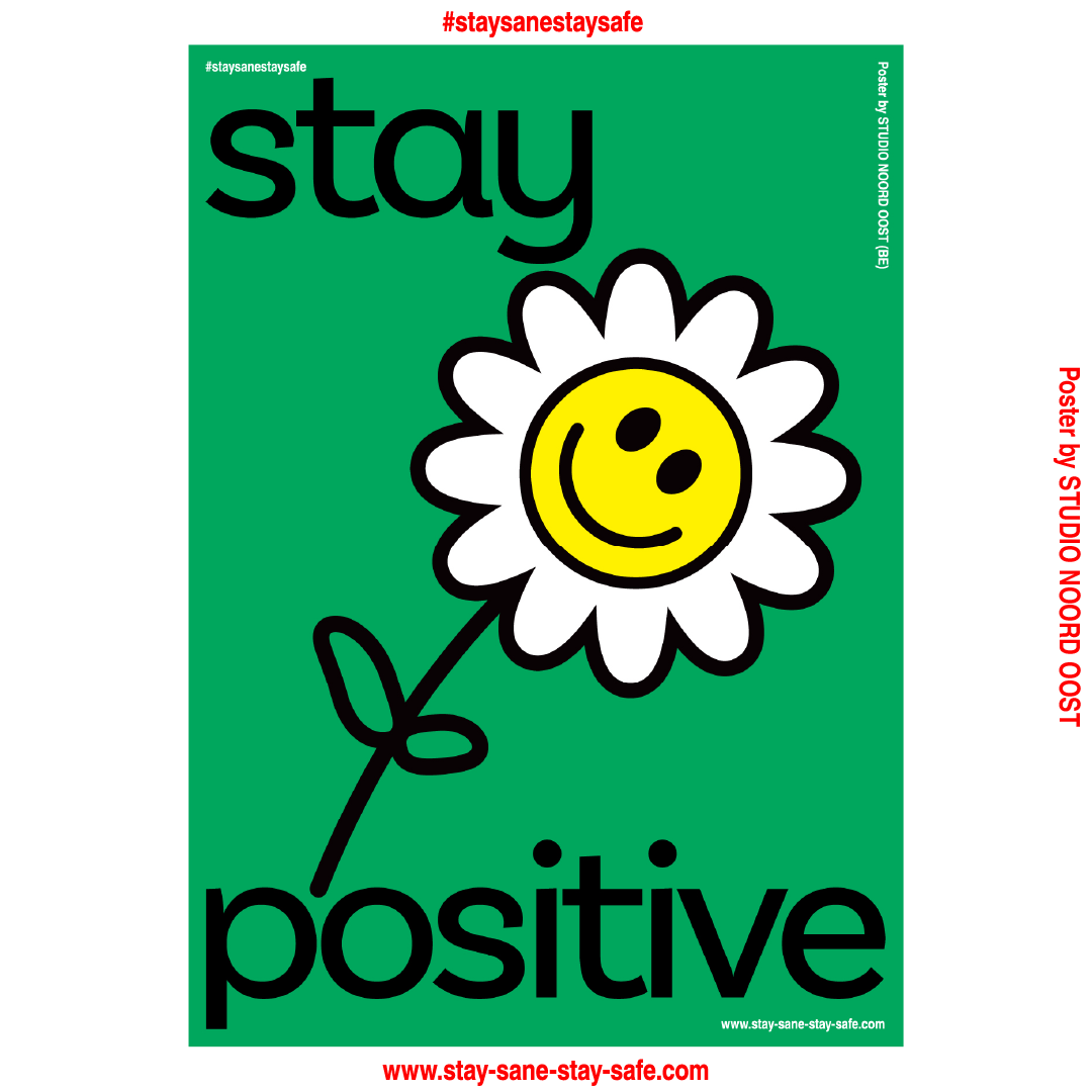
We also found 'stay positive' of the Belgian design studio Studio Noord Oost very strong, it’s nice and simple and uplifting but also applicable for both healthcare providers and the rest of society, say, two birds with one stone.
Here’s some unsolicited advice, we would love to receive more posters like that. ;)
Thanks a lot! Keep up the good work Max and Menno!
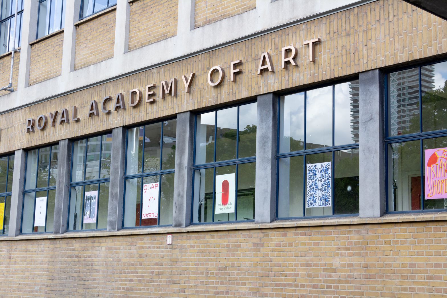
Do you also want a poster on your window? Or would you like to design one too? Check the website of Stay Sane Stay Safe.
Max Lennarts and Menno de Bruijn both graduated in
Follow @studio_lennartsendebruijn and the project @staysanestaysafe.
Interested in our Bachelor Graphic Design at the KABK? Read more about the programme and admission requirements.
